
 |
| Information is Beautiful (Collins, 2009) |
The book's pages are divided into 12 sections (pop, web, though, food, power, life, nature, science, health, film, media and music) with some visuals obviously fitting into more than one neat box. Interestingly the book is only loosely structured around these sections, so information appears to be arranged randomly at times - so as you flick from page to page you can move from 'What's Better Than Sex?' (Youtube apparently), 'Kyoto Targets', 'The Evolution of Marriage in the West' and 'The Great Firewall of China' - all equally attractive in print. The use of visuals even extends into the bibliography, with the covers of various books used as inspiration and source material, instead of a dull list of titles and publishers.
Instead of describing in much more detail the book here are a series of visuals that feature in it, taken from the website of the same name (available here) to give a flavour of the graphics on display.
 |
| When Sea Levels Attack! |
The topic of global warming features heavily in the book, as can be seen by the above graphic which lays out predicted increases in sea level over time with the various relationships to cities around the world and the contributing factors that would cause that increase.
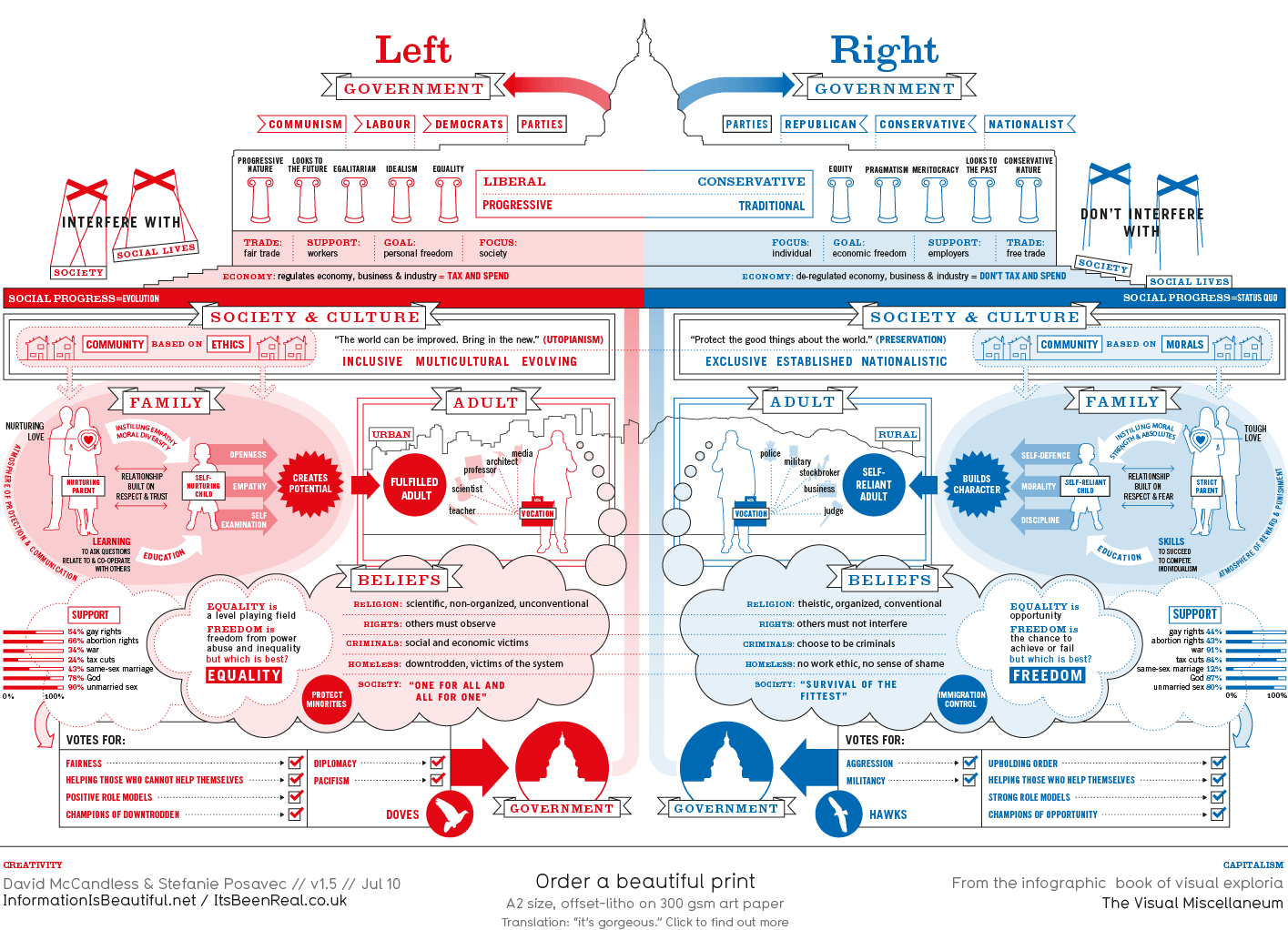 |
| Left vs Right (World) |
In the book the above diagram on the political spectrum of left vs right appears in shades of grey with the note "colour with your country's colour for left and right."
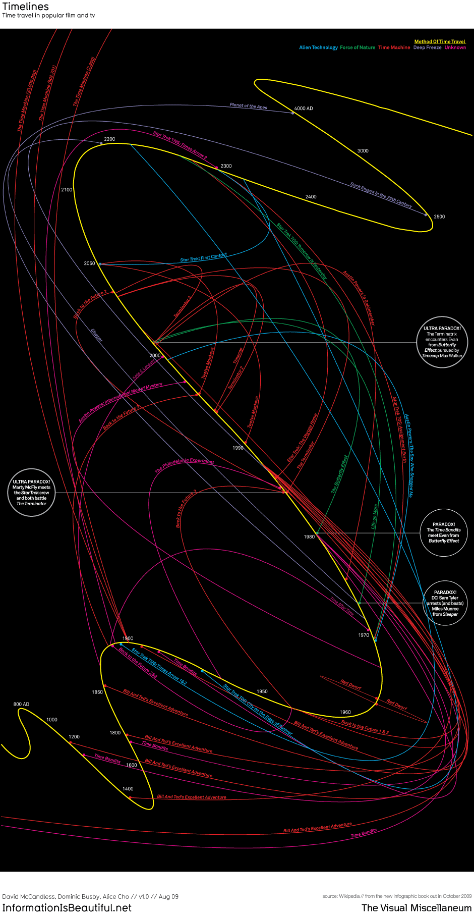 |
| Timelines (Time travel in popular film and TV) |
In print this complex timeline appears on a white background with more humorous instances of 'crossovers' in this fictional landscape of events.
Ultimately what this book is most successful at is not the ease with which it conveys specific ideas or facts but how it collectively shows that information or data can be transformed into a "landscape", through visualisations and diagrams, so that it becomes easier to digest, comprehend and make connections with.
Notes
McCandless, D. (2009), Information is Beautiful, 1st Edition, London: Collins
A TED talk by David McCandless can be found here